Understanding Color Psychology in Branding
Color is more than a visual element; it triggers emotional responses that shape how audiences perceive a brand. Research indicates that color accounts for up to 90% of first impressions, meaning the initial visual cue can set the tone for trust, excitement, or calm before any text is read. Brands that align their colors with the desired emotional tone can influence purchasing decisions and foster deeper connections, as highlighted across multiple industry analyses.
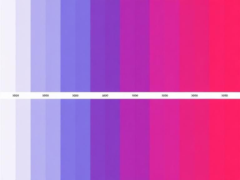
Key Emotional Triggers and Associated Colors
Each hue carries a set of commonly recognized associations. While the source material does not list specific color‑emotion pairings, it emphasizes that identifying the emotion a brand wants to evoke is the first step. For example, a brand seeking reliability may gravitate toward blues, whereas a brand aiming for energy might select reds or oranges. Understanding these associations allows marketers to craft a visual identity that resonates with target audiences.
Building a Cohesive Brand Palette
Constructing a palette involves several disciplined stages. The process begins by defining the brand’s personality and the core emotion it intends to communicate. From there, designers choose a primary color that embodies that emotion, followed by secondary and accent colors that provide harmony and visual interest. Industry guidance recommends incorporating color harmony principles and staying aware of current trends to ensure relevance. Real‑life examples demonstrate how thoughtful selection creates a palette that feels both distinct and adaptable.
- Define brand personality and target emotion.
- Select a primary color that best reflects the chosen emotion.
- Choose secondary colors that complement the primary hue while maintaining harmony.
- Add accent colors for contrast and emphasis.
- Validate the palette against industry trends and audience expectations.
Applying the Palette Consistently Across Touchpoints
Consistency is a measurable driver of brand success. Brands that codify and apply their colors across every customer touchpoint experience up to 80% higher recognition. This includes digital assets, packaging, signage, and employee apparel. By establishing clear guidelines—such as exact color codes, usage ratios, and prohibited combinations—organizations ensure that each visual interaction reinforces the same emotional message.
Measuring Impact and Adjusting Over Time
After implementation, brands should monitor key performance indicators linked to visual identity. Increases in brand recognition, trust metrics, and conversion rates can often be traced back to a well‑executed color strategy. Small businesses and entrepreneurs are encouraged to seek professional guidance when selecting colors, as the right palette represents a strategic investment in long‑term success. Ongoing assessment allows for refinements that keep the brand visually aligned with evolving market expectations.
Conclusion
The psychology of color offers a powerful, data‑backed framework for shaping brand perception. By understanding emotional triggers, building a harmonious palette, and enforcing consistency across all brand assets, companies can boost recognition, build trust, and influence purchasing decisions before any written message is encountered.